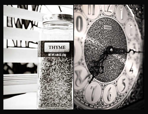
Cara and I chose
time this week as our theme. I had so many different ideas, but ultimately went with the traditional. The photo I took (on the left) is the face of a grandfather clock that was given to me by my grandmother. I've always loved this clock so it is a bit sentimental to me. I love Cara's take on the theme. I think the photos fit together, but are so different.

If you have some extra time today, head over to Megan's to see some more creative themes.
14 comments:
You're right, complete opposite but perfectly matched. I also love the bw conversion, adds to it nicely. Great job, team.
I like the play with black and white.
Yes, the two b/w shots match wonderfully. But I also love the texture in each shot. Great DOF on the clock and cleverly done with the Thyme!
it is a really great diptych -- those big clocks can be so ornate and wonderful details to photograph!
yes, the traditional interpretation - but so well captured with such detail! The b&w conversions and textures really make the 2 images fit together nicely.
SO clever!! I love the b&w, was it planned or a happy coincidence! They are both great shots.
I love both your takes on the theme and together they work so well! Yes, love the texture that you both have captured with these shots. Having them both in black and white really brings it out.
Such contrast in the photos, yet pulled together perfectly with the matching b/w tones. And another great theme!
They are both great. The wordplay was a great idea, however your clock shot is wonderful and very detailed. The b/w of both shots really brings them together. :)
great set. lovely in black and white. :)
both are lovely shots!
Love this. The b&w really emphasizes how well the textures complement one another.
very cool how the textures go together so well! Love both of these!
What a great pair! The B&W jumped right out, but like Jaimee said the textures are amazing too!
Post a Comment