This week
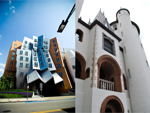
Cara chose Structures as our theme. I thought that should be easy enough. I actually imagined photographing something that the kids built with legos or blocks, but then I remembered this shot that I took a couple of weeks ago at the Renaissance Festival. I thought it would be perfect. I mean it is a castle. The man who lives in this castle has been working on it for 40 years now. It is so remarkable.
Cara's photo is so intriguing. It's definitely not the type of structure you see every day. That is for sure. I love that her shot is so modern and mine is more medieval.

Grab a partner and join in on the fun over at Mental Inventory.
10 comments:
O O O O O O is that a Frank Gehry building on the left? I LOVE him! Can you imagine, living in a real live castle? amazing. Great dip!
both so visually intriguing! love the contrast of the sharp angles and the soft roundness.
oooo what a fun set. they work so well together. I love the modern and the medevil. how fun!
Cara's photo puts me in mind of Dr. Seuss. Yours of Rapunzel. Lovely photos both. :)
It so funny you say that you were going to take a shot of something the kids built. I was going to use a shot I took of a archway that my brother had build with a set of blocks. Then when I saw this building I scrapped that idea. I like the contrast of the modern vs medieval.
the contrast is excellent! How fun, I just keep staring at the two images. They work so well together!
I love both these pictures, they are so different in style but go so well together too. Great combo! :)
the contrast between the two shots make it so very interesting! i would like to live in a castle...not clean it so much, but live there!
Oh, I love that Ren Faire castle! So very cool! Actually both are exceedingly cool and great juxtaposition - modern and midievil.
You're right -- the contrast between your two shots couldn't have been better if you had planned it that way!
Post a Comment